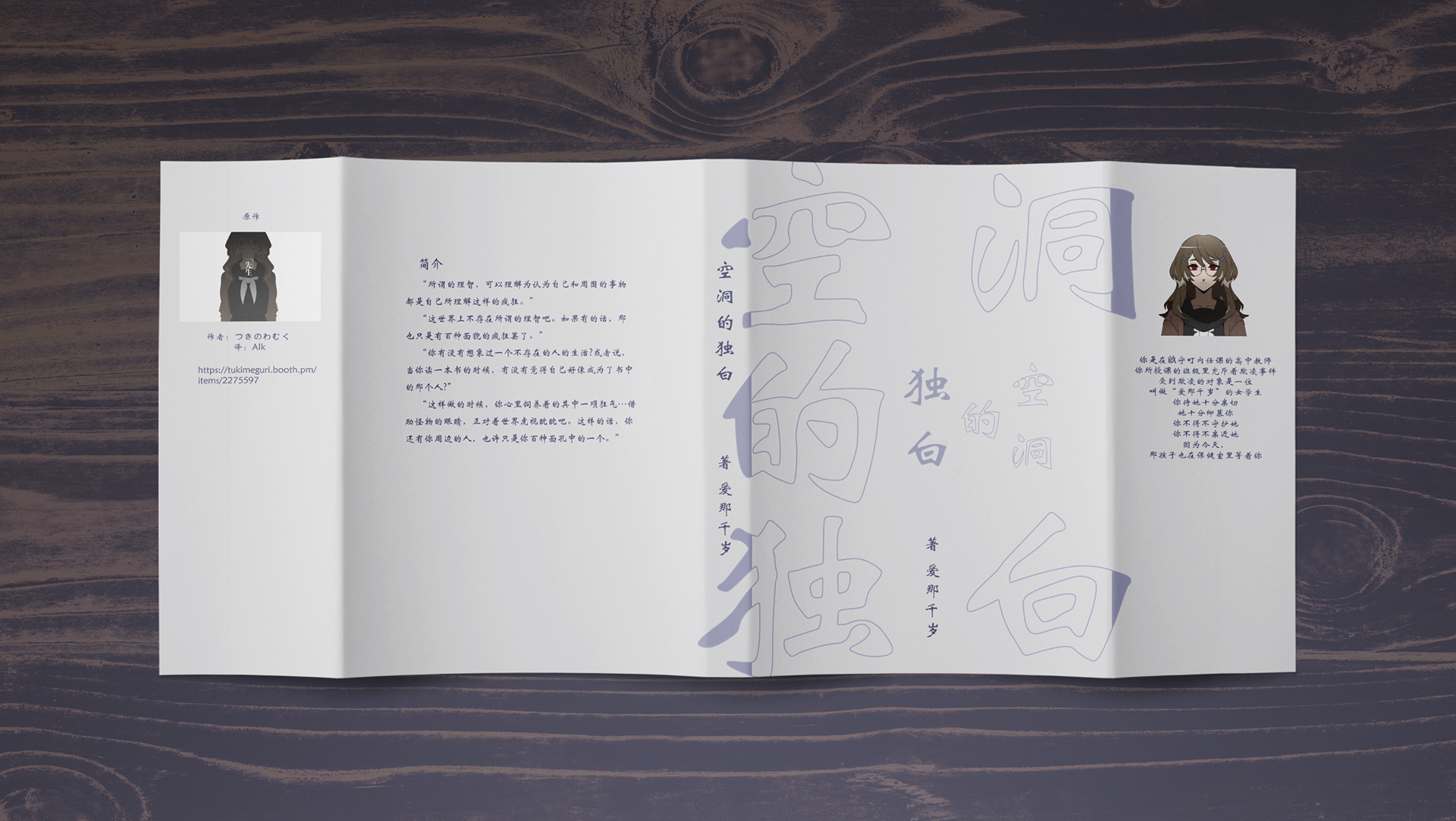
The course project was to design a logo for a sporting event or team. I chose Kentucky Derby out of interest because one of my gridend mention of horse-racing-related games, and to design a logo for a sporting event or team.
Previous logo designs Sample
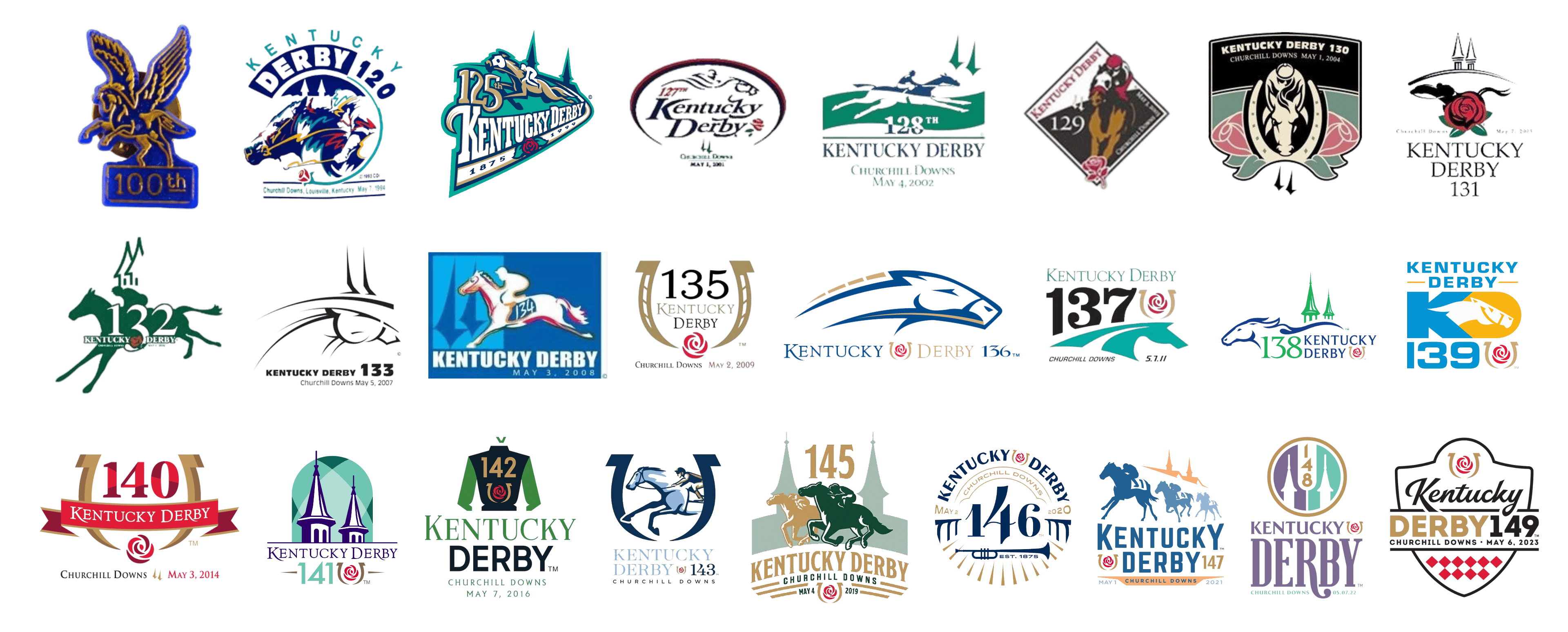
Through an analysis of past Kentucky Derby logos, I identified several recurring elements:
Horses, Riders, Horseshoes, the TwinSpires tower, and Roses
In terms of color schemes, previous logos commonly used
Navy Blue, Forest Green, Gold, and Rose Red
Those colors reflect both the natural and cultural elements of the racetrack. The overall visual language leans toward modern elegance and aristocratic refinement.
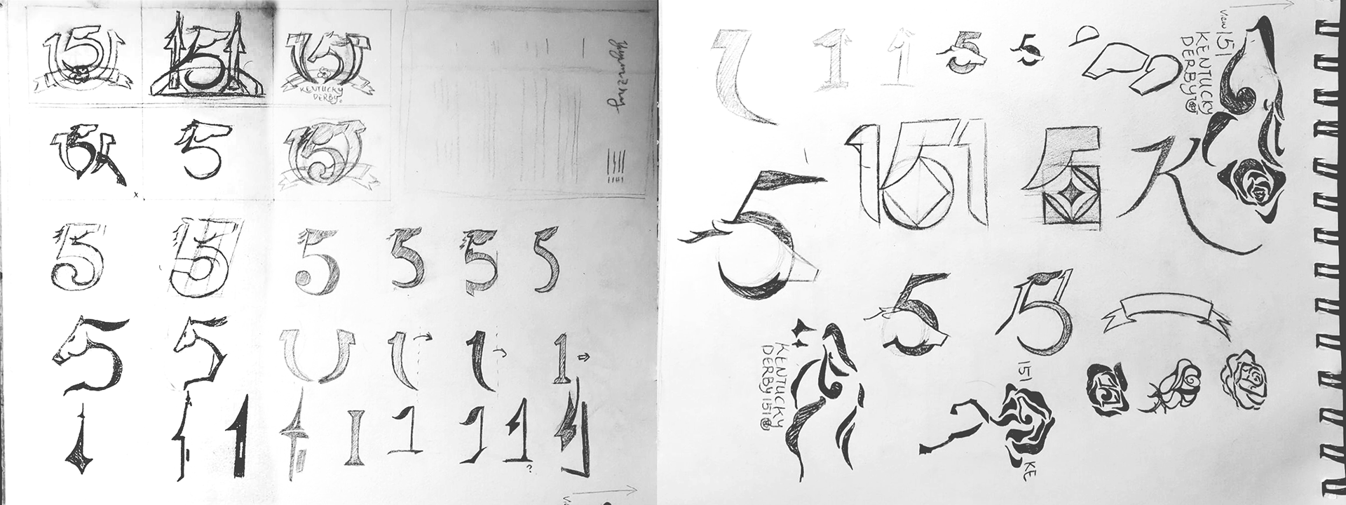
Sketch
Since not all past logos include every element, I saw an opportunity to selectively highlight a few in my design. I began with an exploration of the number "151," the identifier for the 151st Kentucky Derby. I experimented with how the digits themselves could be visually transformed. For example, the two "1"s could potentially become flags, horseshoes, or towers, while the "5" could offer both positive and negative space for integration.
Draft
Initially, I focused only on the positive shape of the "5," modifying its top horizontal stroke to resemble a horse’s mane and curving the end into a horse’s knee. However, this approach led to severe legibility issues, as the design no longer read clearly as "151." I decided to abandon that version in favor of an idea that used negative space to outline a horse's shape.
At the same time, I explored incorporating rose elements into the logo, using negative space to suggest the silhouette of a horse. However, I realized that if the design focused solely on roses and horses without referencing the number “151,” it would lose its specificity. Such a logo could be applied to any horse racing event or any context related to the "Run for the Roses" theme, thus diminishing the unique value of this design for the 151st Kentucky Derby.
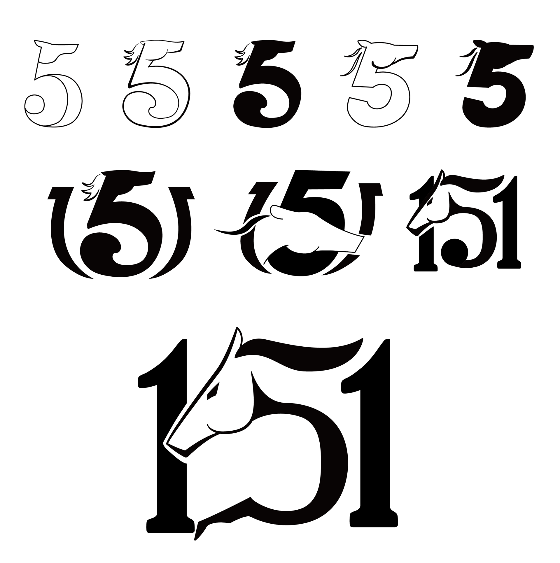
Earlier logo development
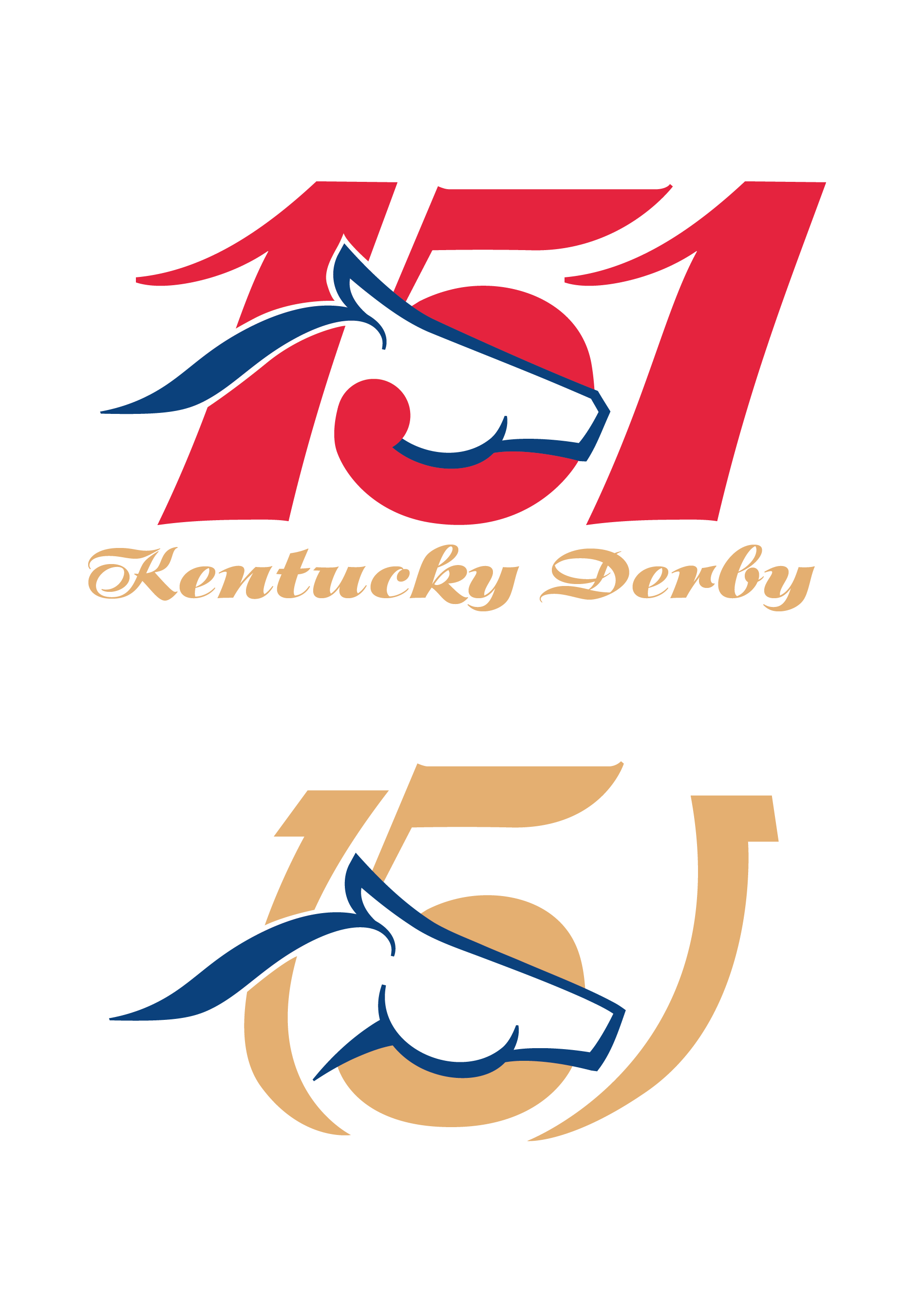
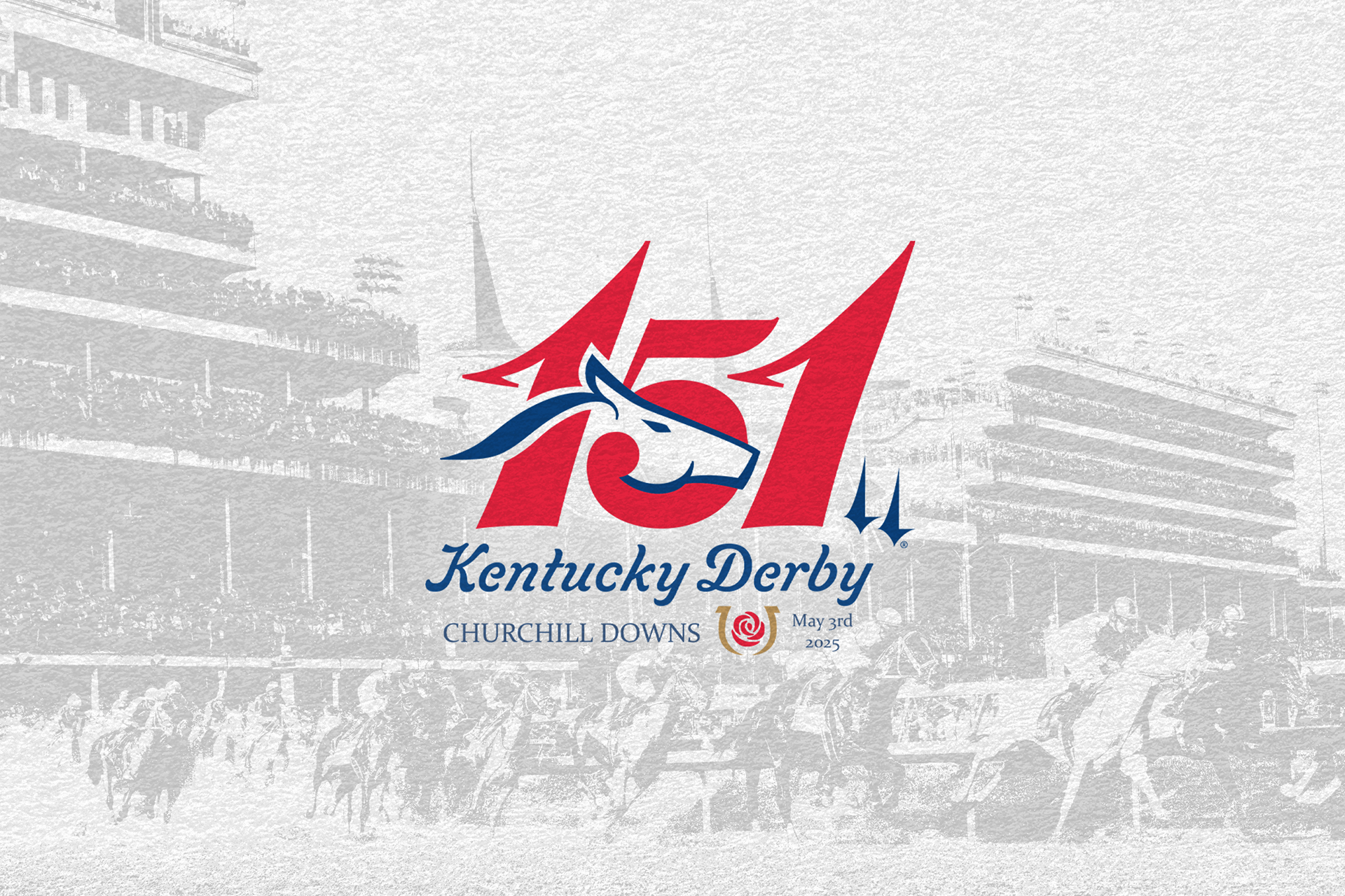
I eventually returned to the negative space within the "5" and discovered its inner curve closely resembled a horse’s jawline. This insight became the breakthrough for my final concept—placing a simplified horse head inside the "5" to emphasize the theme of horse racing. For the two "1"s, although using them as decorative horseshoes was imaginative, the resulting form again compromised legibility. Instead, I subtly altered the shape of the "1"s and embedded the silhouette of the TwinSpires tower to tie the design to the race’s historic location.
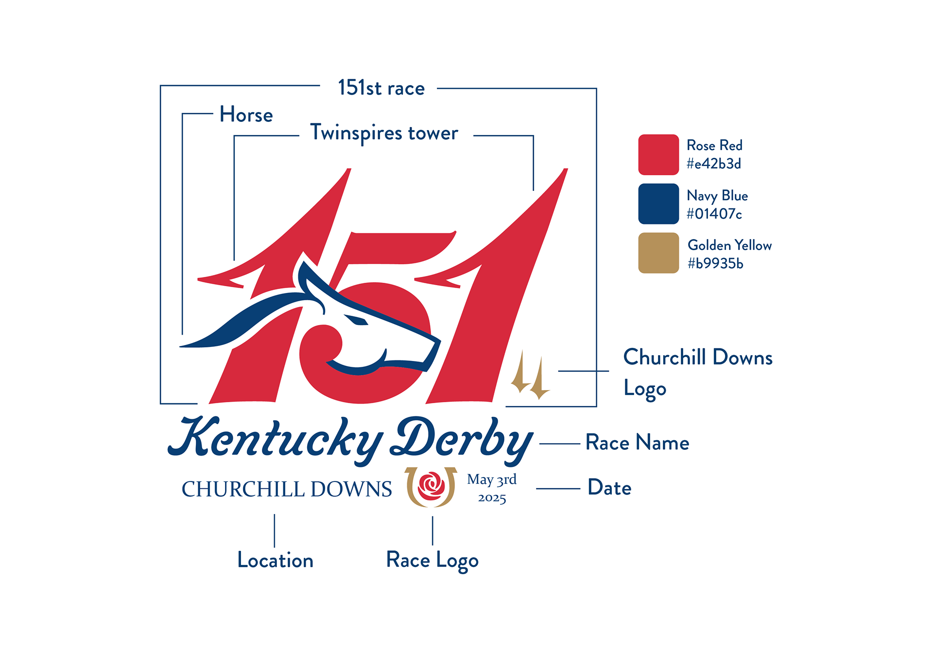
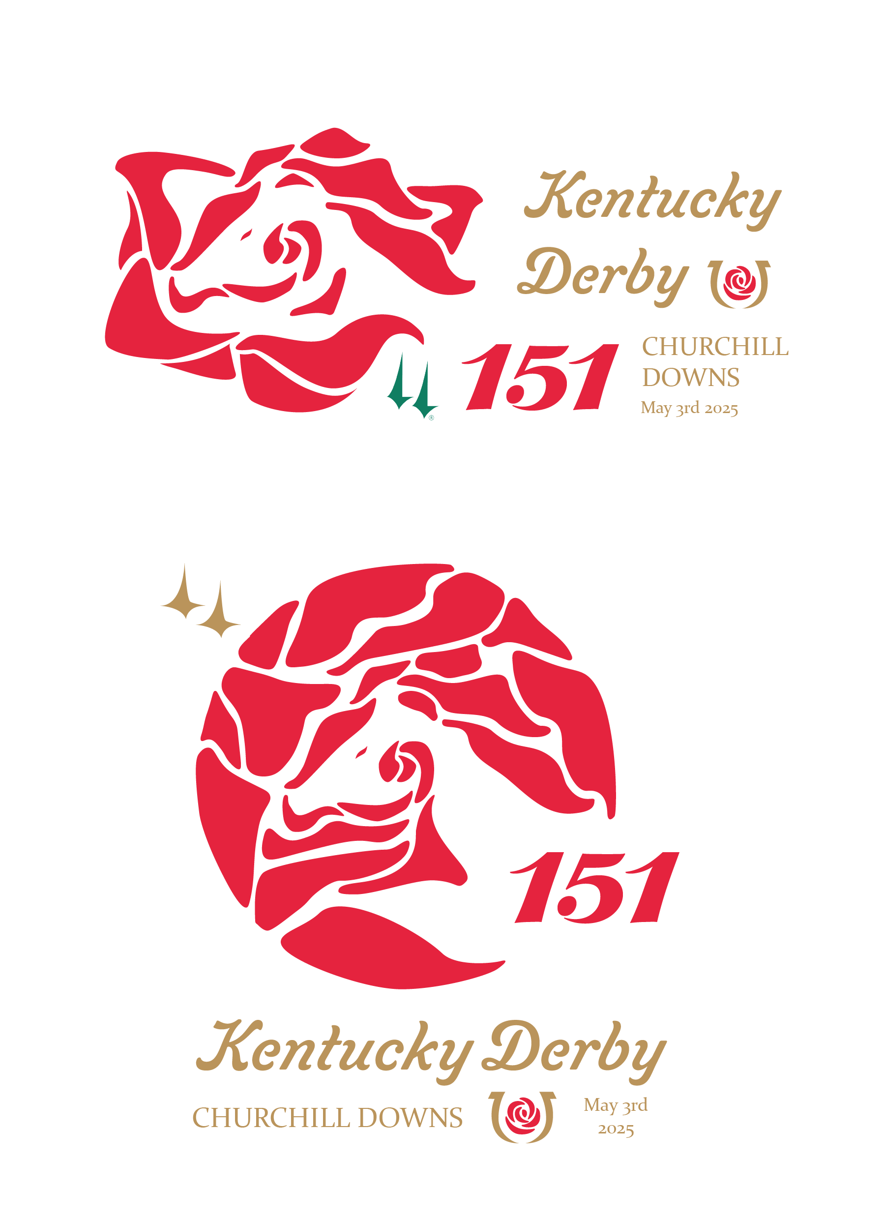
For typography, there is no fixed standard for Kentucky Derby logos, so I prioritized a clean yet ornate visual tone. I chose a flowing, elegant script for the primary logotype to evoke sophistication, balanced by a refined old-style serif font for supporting information.
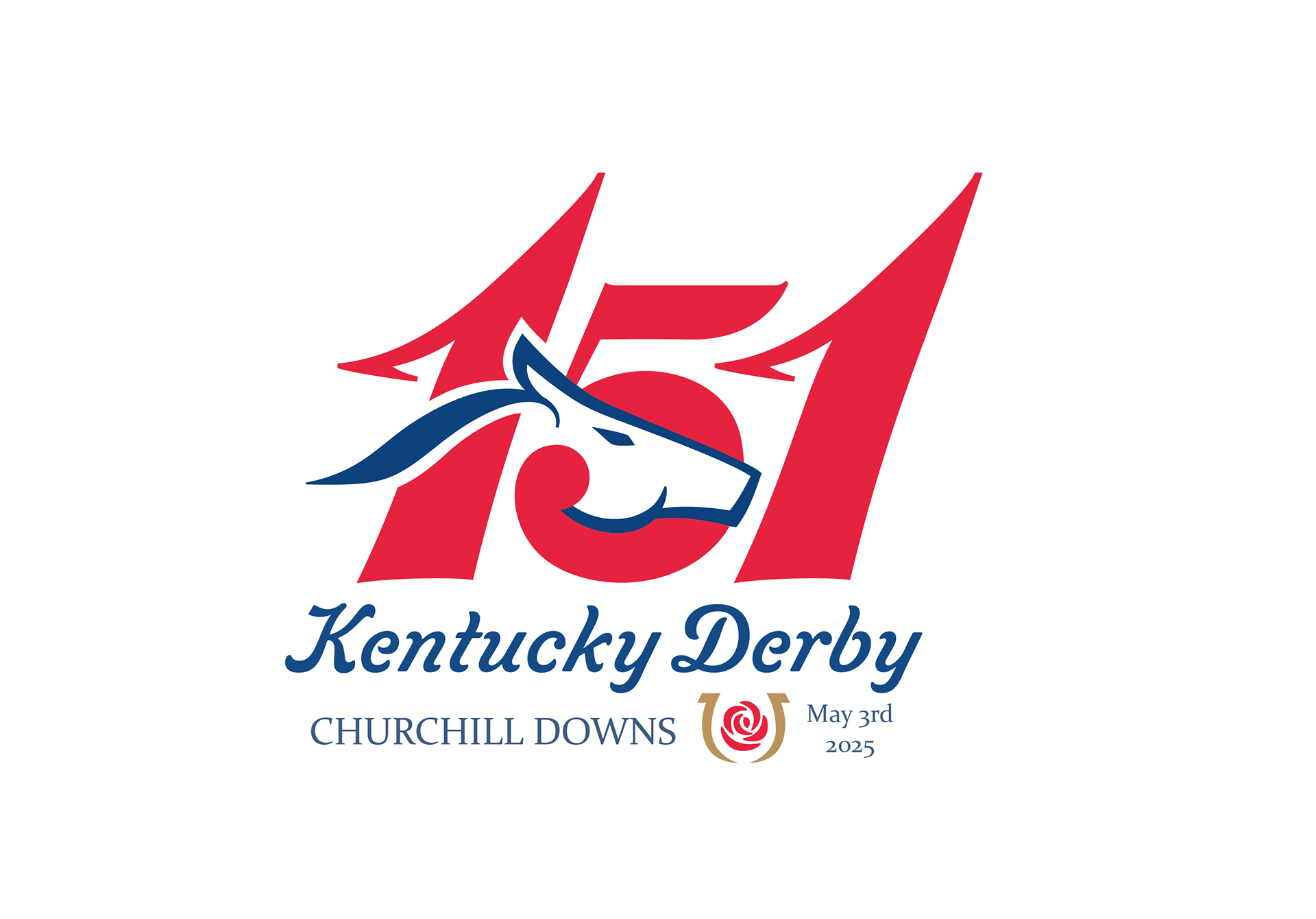
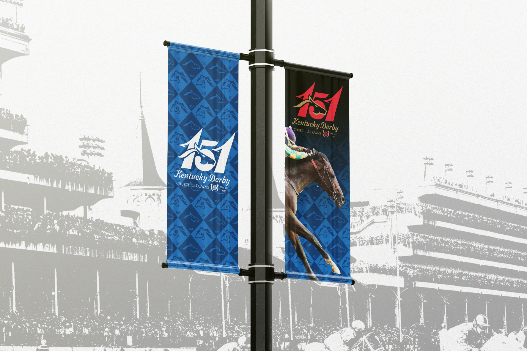
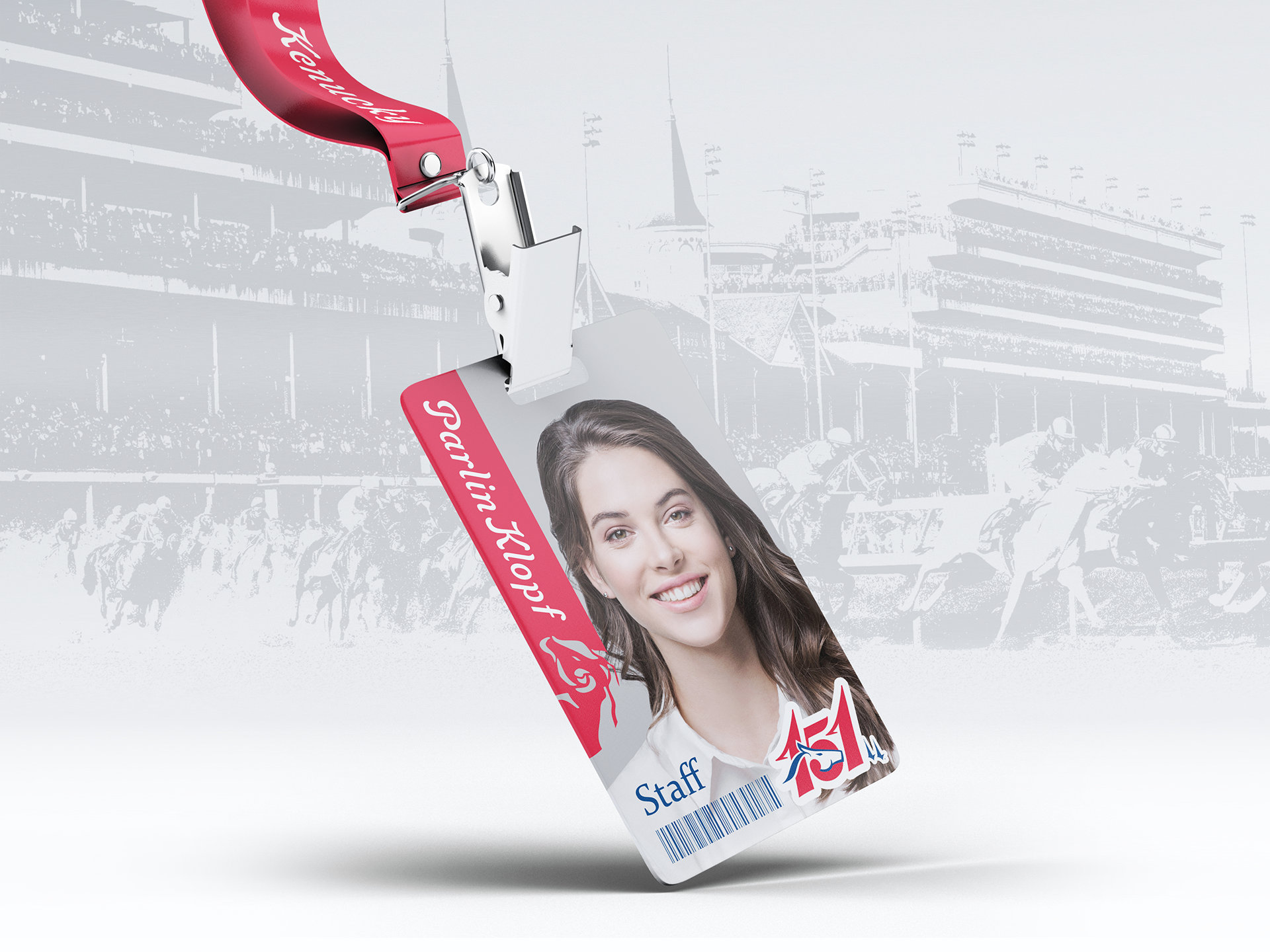
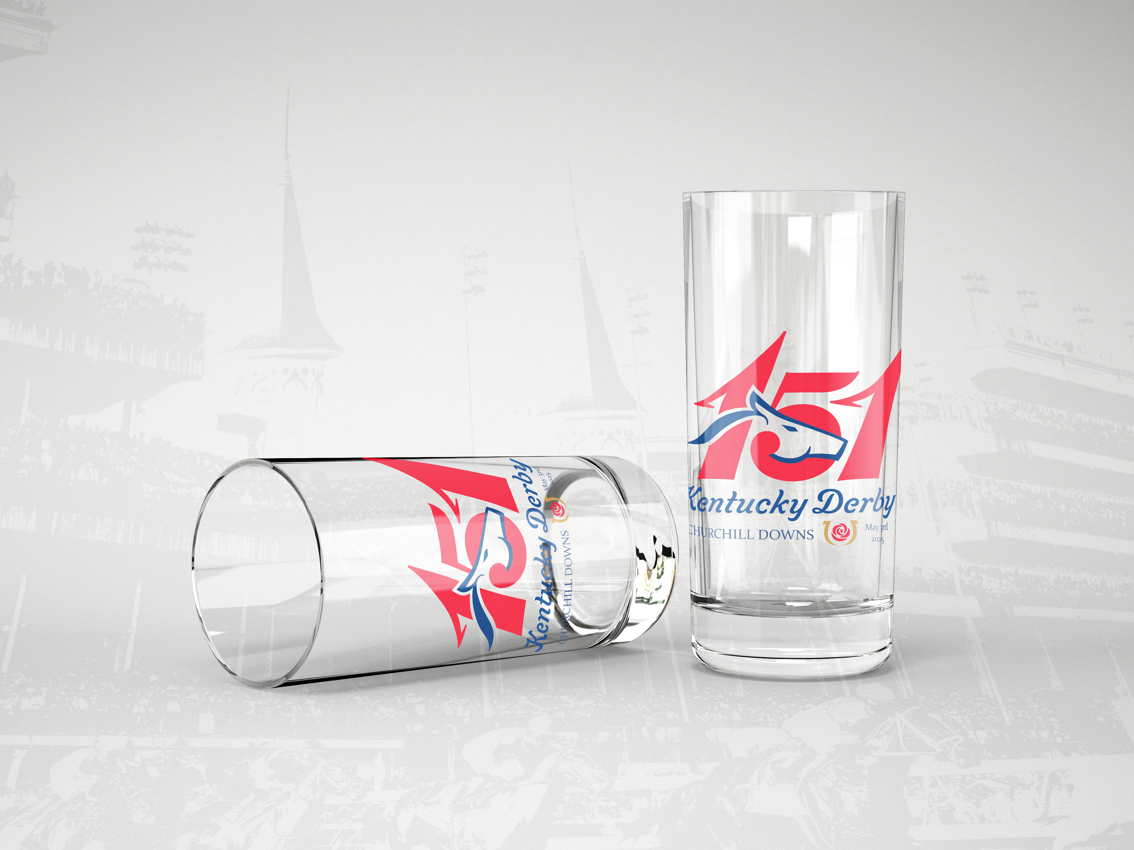
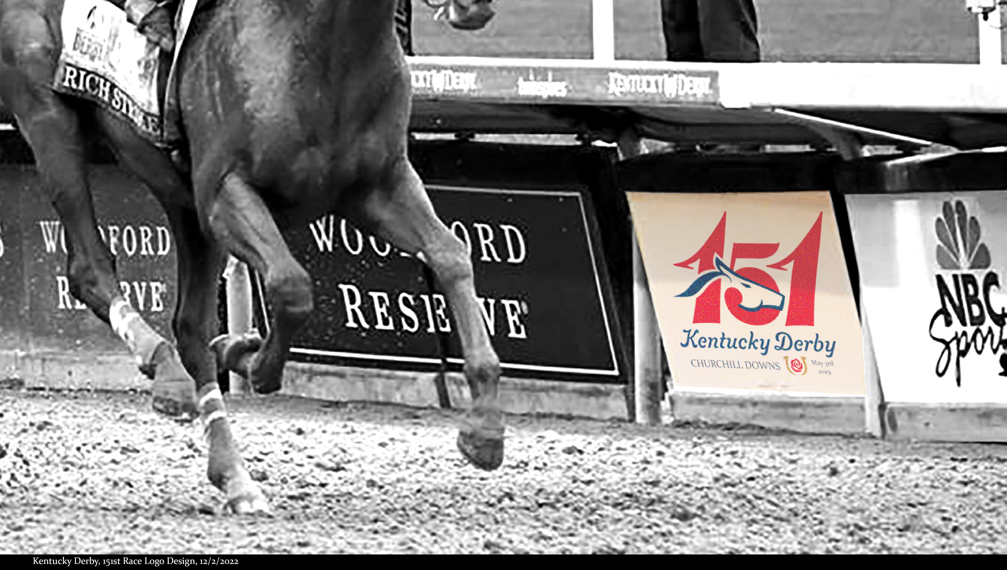
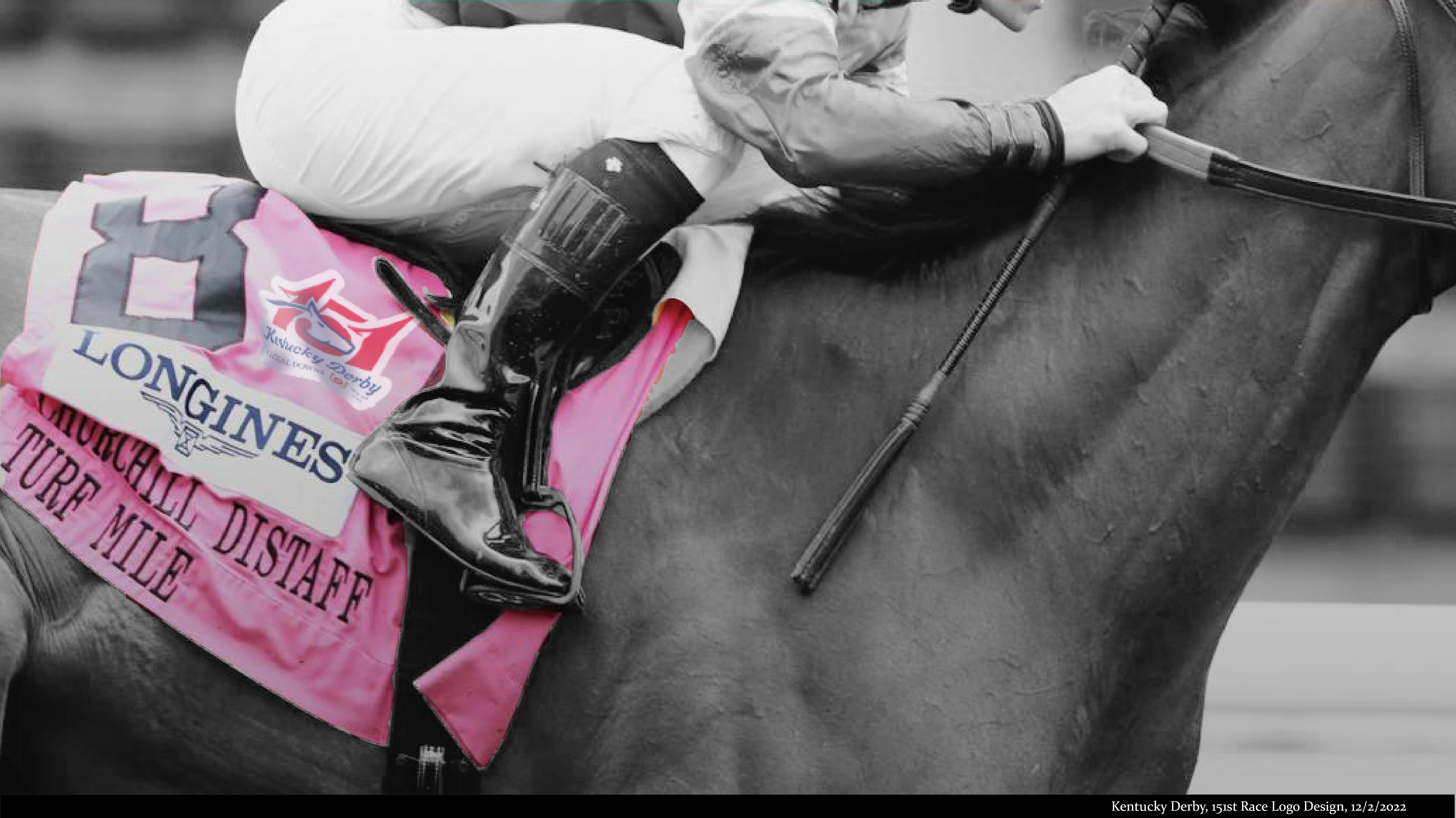
Final Logo Design
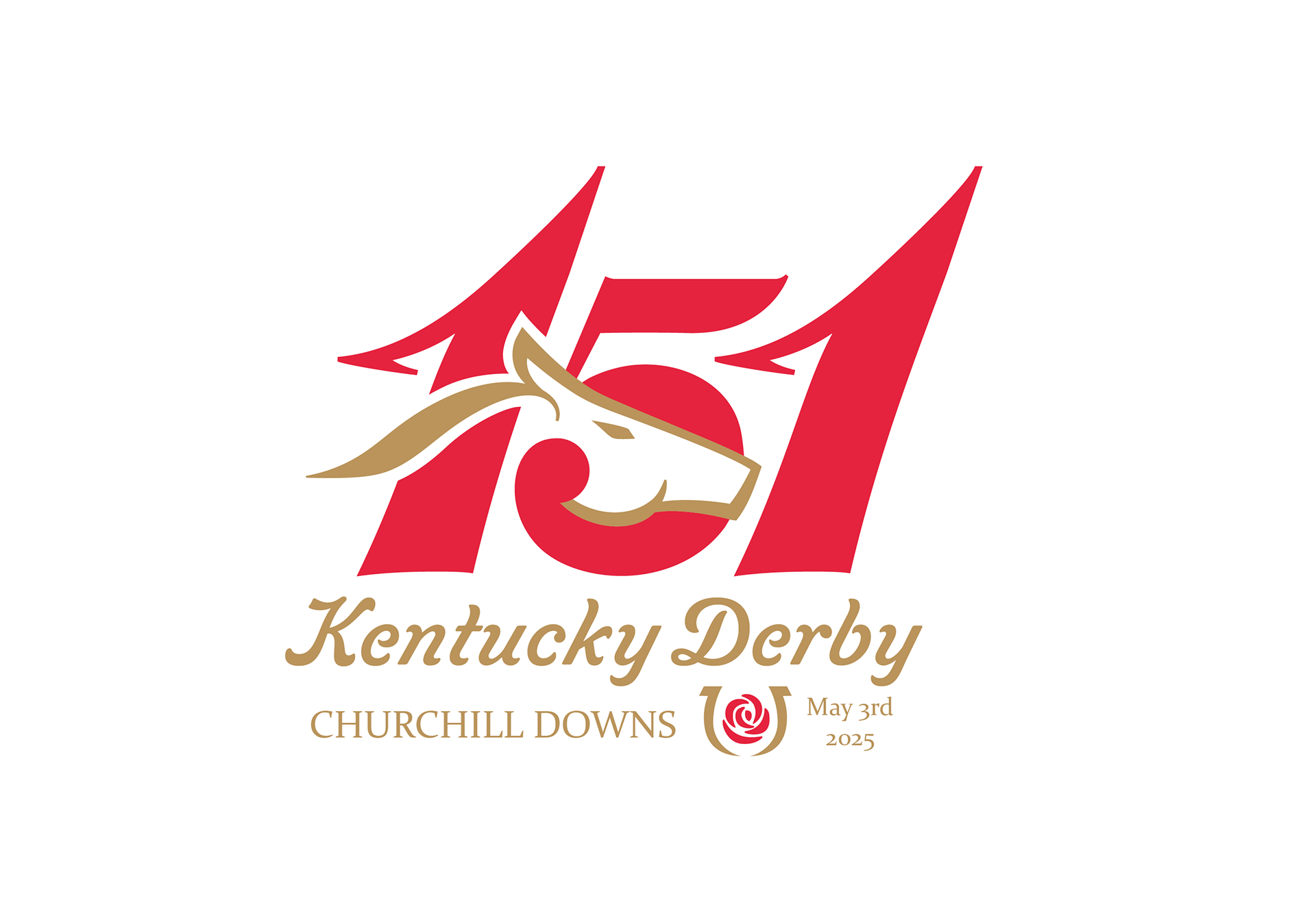
Second Color Version
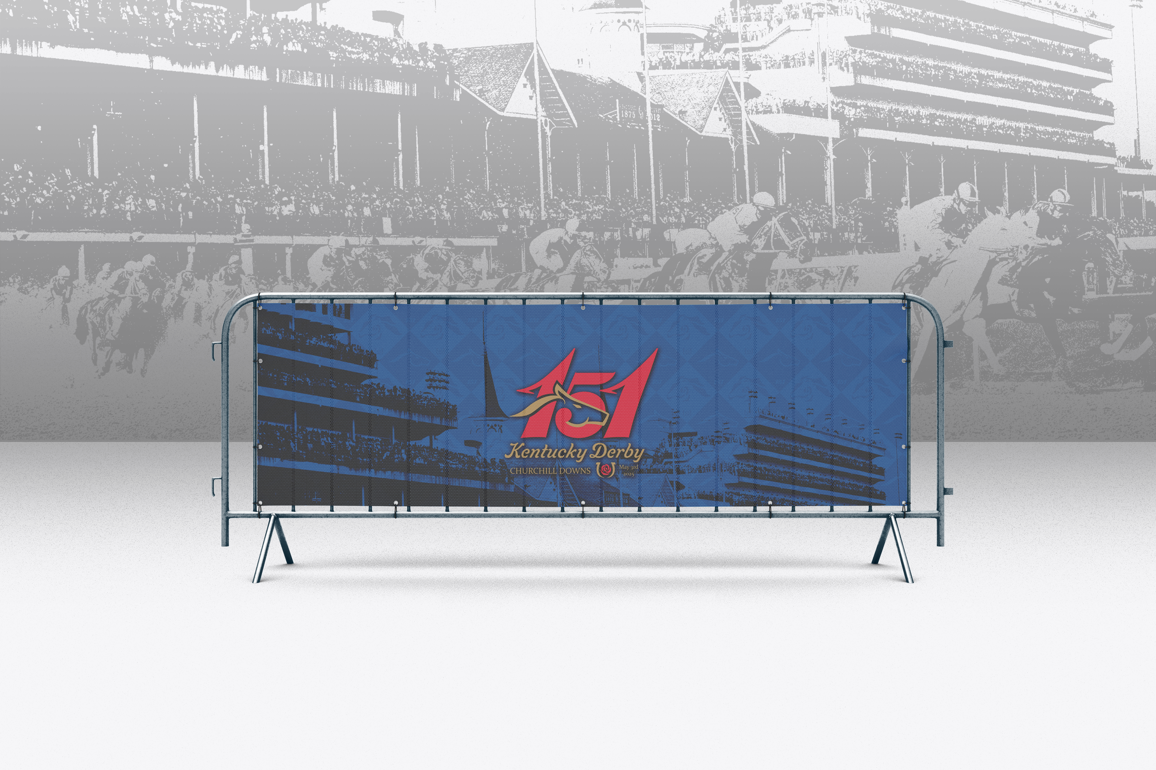
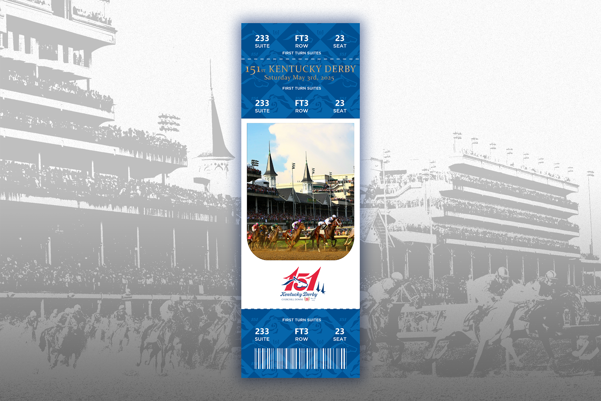
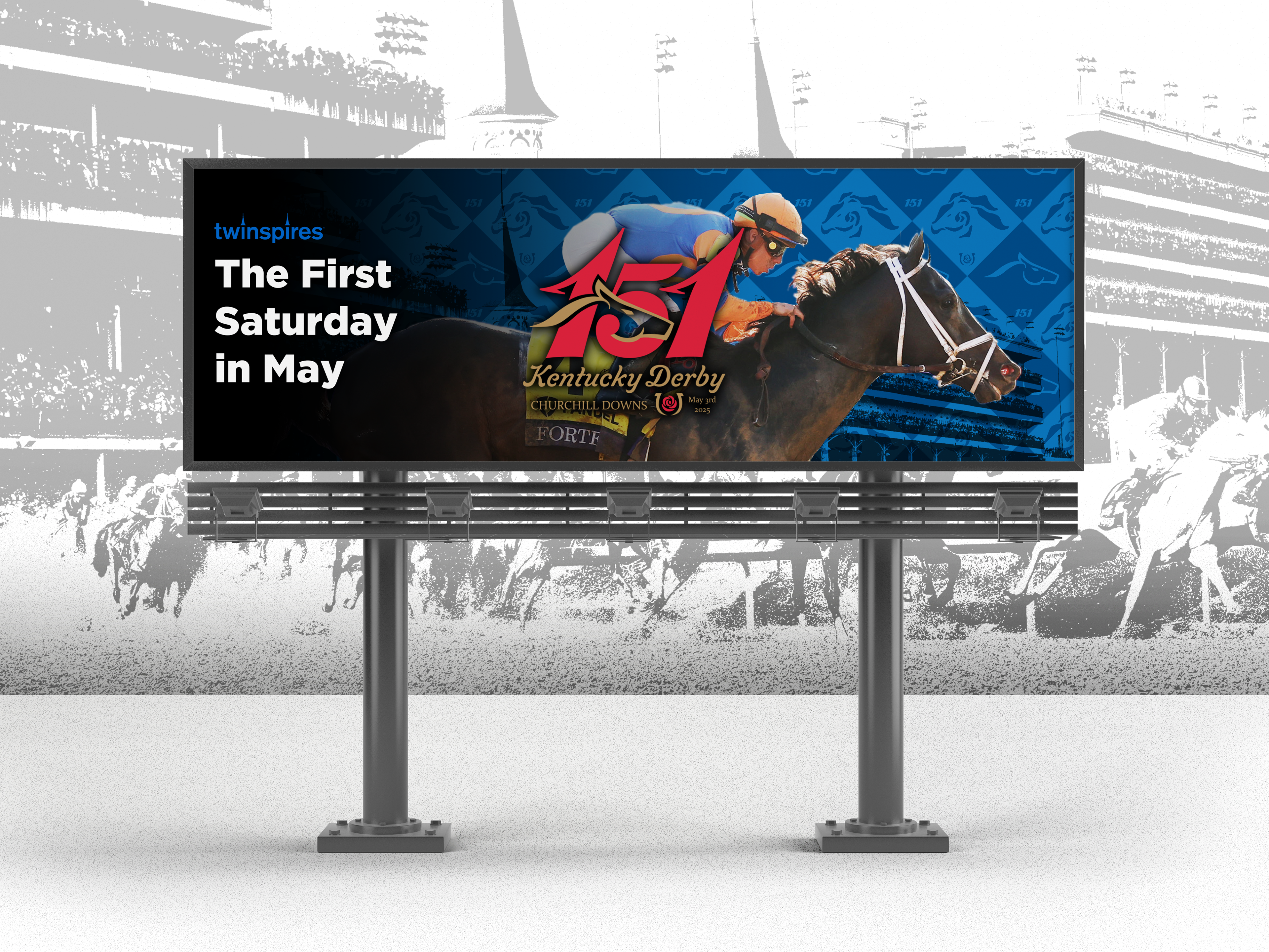
The final logo uses rose red as the primary color, with alternate versions in gold and navy blue to suit various background contexts while maintaining strong visual contrast. The rose and horse motifs were further developed into a repeating pattern used across merchandise, reinforcing brand identity while adding visual richness.