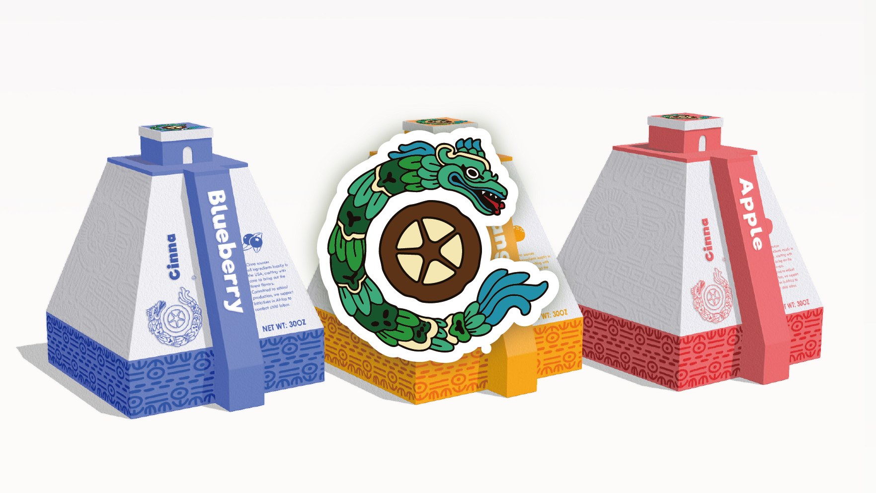
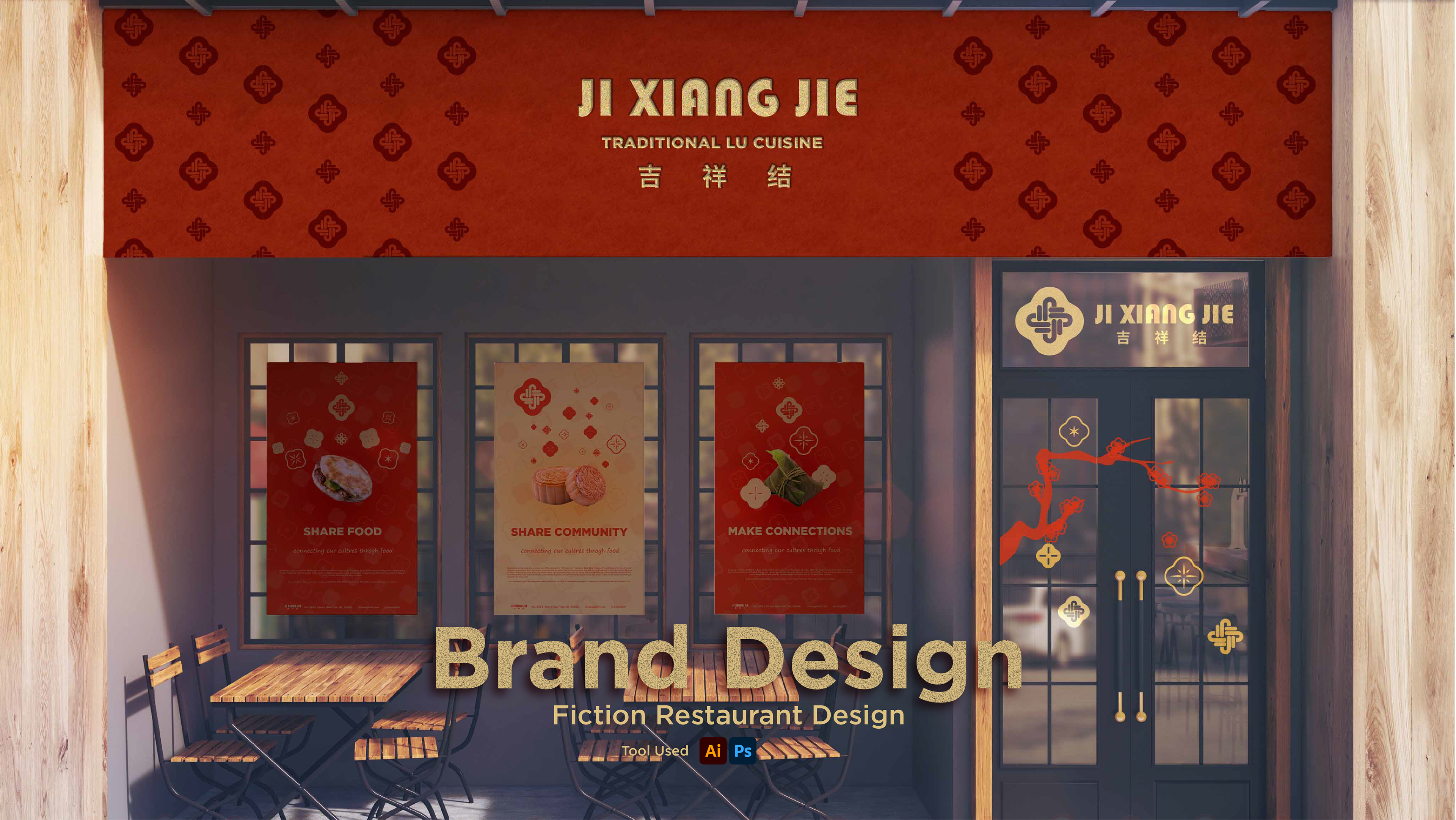
The project was to design a restaurant brand. I chose one of the lesser known Chinese restaurant cuisines in the US, Lu Cuisine. As one of the traditional Chinese cuisines, I chose to use a Chinese knot as the inspiration for the logo design to show the traditional elements.
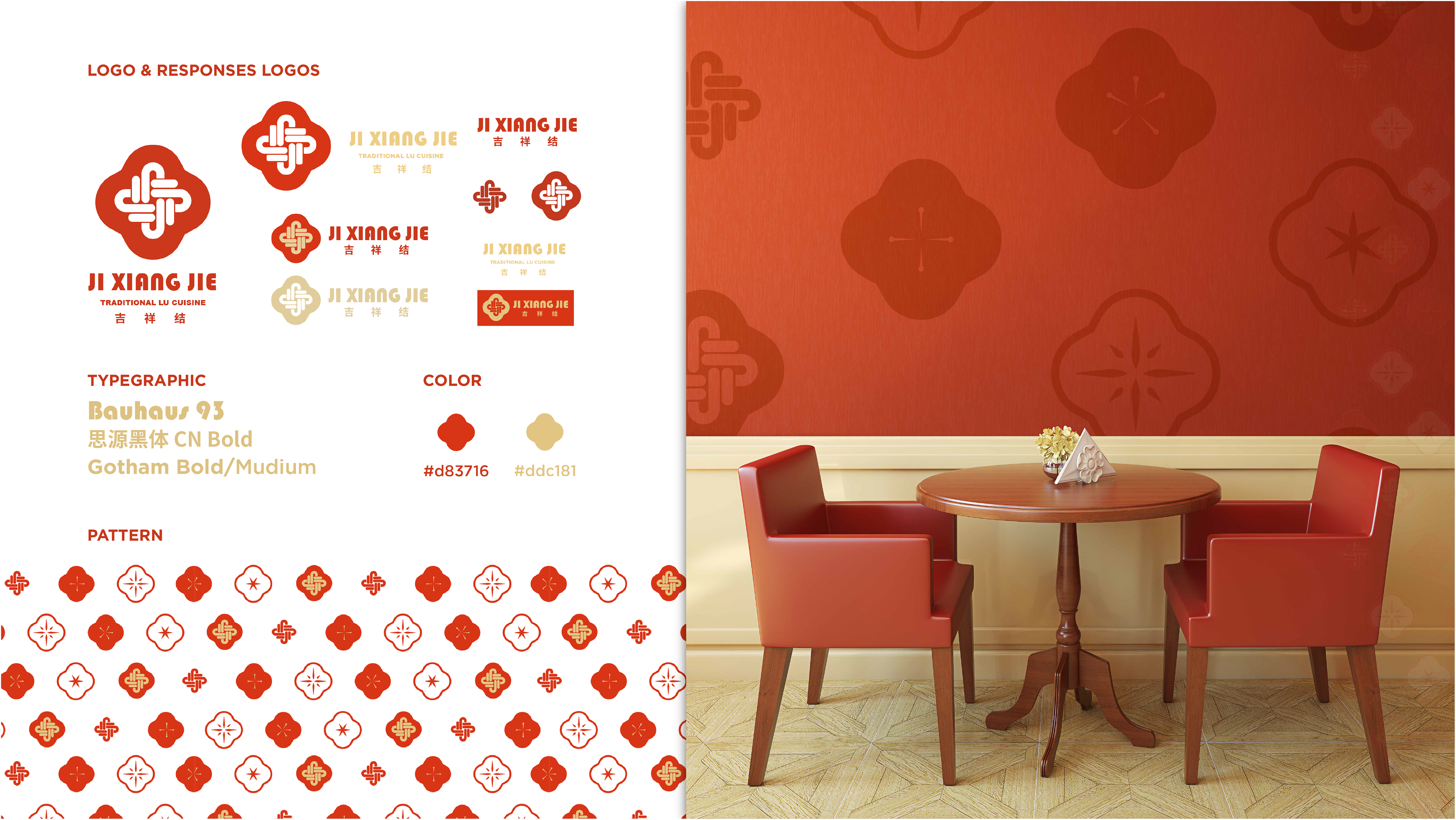
Ji Xiang Jie is one of the Chinese knot preparation styles that possesses a simple shape and appearance. Therefore, my logo adopts an abbreviated appearance of it, with the internal pattern briefly imitating the original knot style and incorporating the first word JI. Separately splitting the internal decorative pattern and the outer outline can exist as separate pattern decorations. For the color choice I used traditional Chinese red and gold as secondary colors.
The exterior of the store (previous page) is a common street-side restaurant, more in line with American habits. On the door, it is decorated with traditional Chinese window flowers. The poster also advertises traditional Chinese food.
The exterior of the store (previous page) is a common street-side restaurant, more in line with American habits. On the door, it is decorated with traditional Chinese window flowers. The poster also advertises traditional Chinese food.
Web design
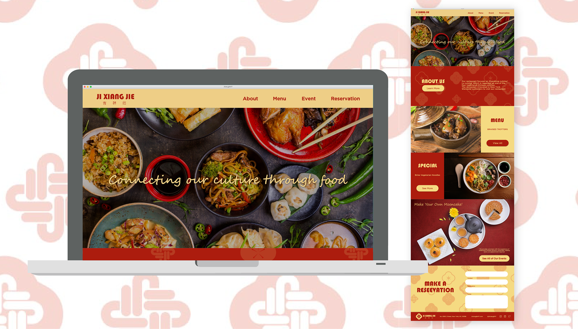
The main colors are red and yellow. The font follows the font choice on the logo design. A brief introduction of the restaurant, menu, and recent recommendations. Because the restaurant is designed to be an interactive experience, traditional Chinese events can be experienced during special times, so the official website includes events such as "Experience Moon-cake Making". At the end is a form to sign up for membership or to reserve a seat.
The main colors are red and yellow. The font follows the font choice on the logo design. A brief introduction of the restaurant, menu, and recent recommendations. Because the restaurant is designed to be an interactive experience, traditional Chinese events can be experienced during special times, so the official website includes events such as "Experience Moon-cake Making". At the end is a form to sign up for membership or to reserve a seat.
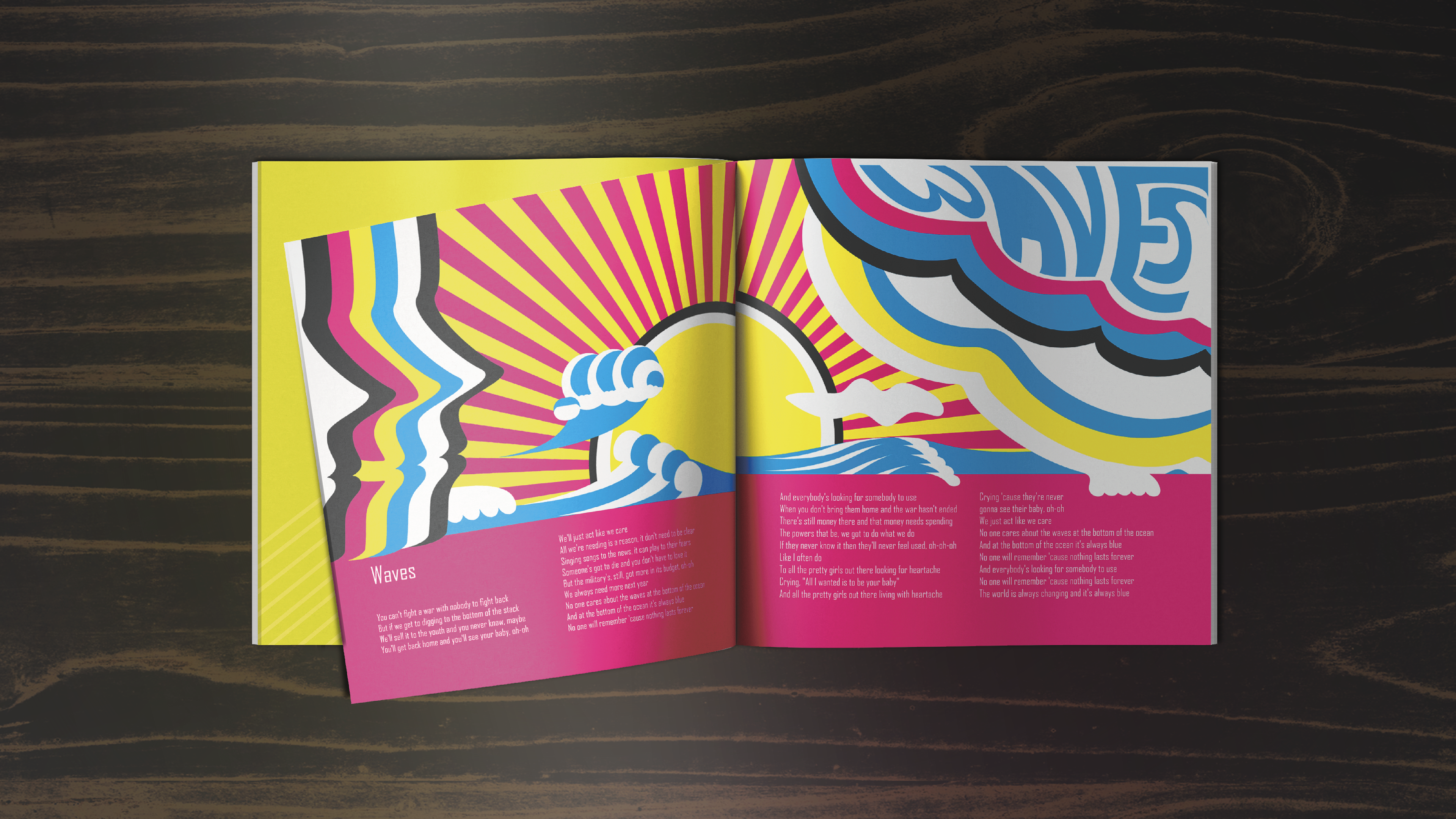
Poster design
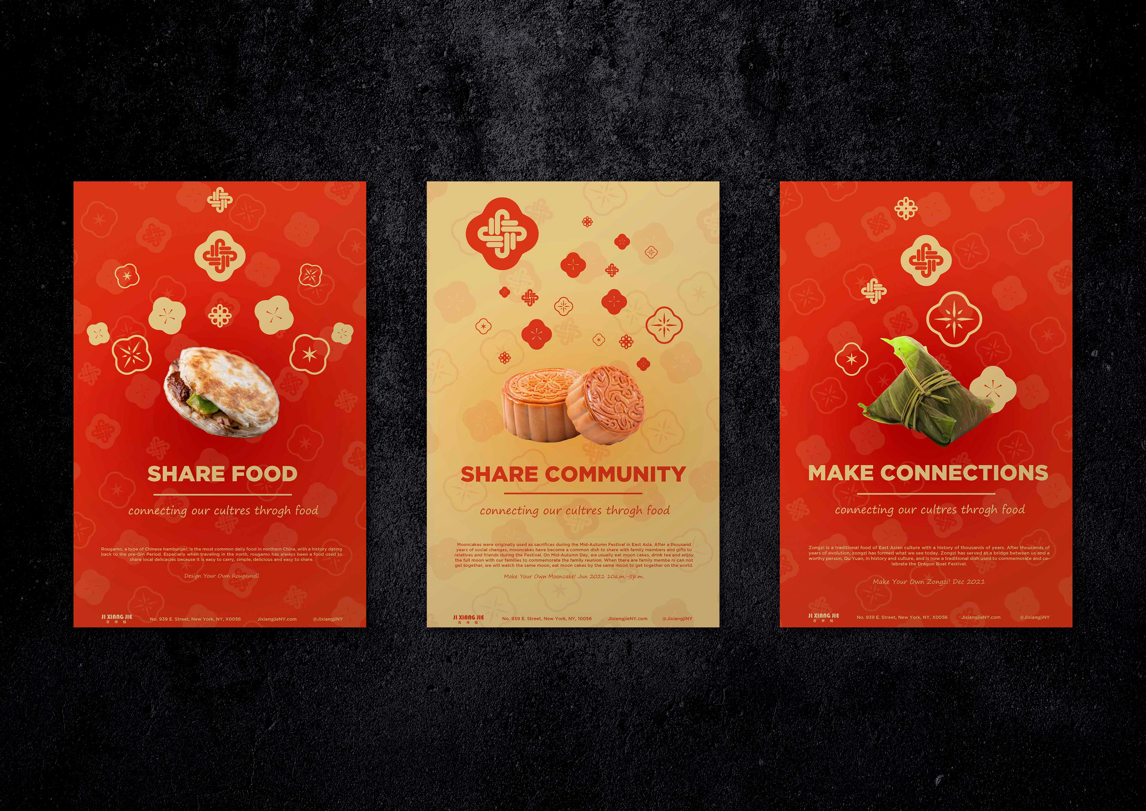
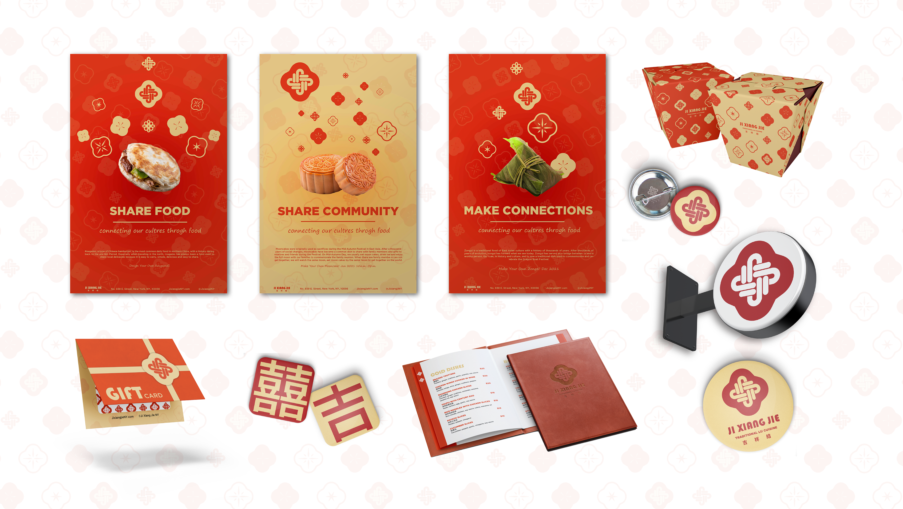
The poster also uses red and yellow as the main colors, with a photo of the food used for promotion in the middle, and the restaurant logo and other patterns as decoration. The slogan of the restaurant, the introduction of the food on the picture and the information of the restaurant are used as publicity to attract customers who are interested in different cultures to come and experience.
The poster also uses red and yellow as the main colors, with a photo of the food used for promotion in the middle, and the restaurant logo and other patterns as decoration. The slogan of the restaurant, the introduction of the food on the picture and the information of the restaurant are used as publicity to attract customers who are interested in different cultures to come and experience.
Other
The design of the gift card makes the wrapped card look like a gift box tied with a gift flower, and the restaurant's logo is decorated as a gift flower on the ribbon.
The take-out box is designed like a traditional Chinese take-out box and is decorated with a pattern.
The badge design uses Chinese characters with good meanings, one of which is "Xi" and the other is the "Ji" of
"Ji Xiang Jie".